Cartopy 绘图示例库
Cartopy 是为了向 Python 添加地图制图功能而开发的扩展库。该项目致力于以 matplotlib 包为基础,用简单直观的方式操作各类地理要素的成图。Cartopy 官网的画廊页面已经提供了很多绘图的例子,它们和官方文档一起,是学习该工具的主要材料。
本文亦提供一些例子,演示 Cartopy 在测量学等领域的应用,包括绘制中国政区图、IGS 站点分布、GNSS 控制网、地球板块分布、GNSS 速度场、电子含量分布以及突出显示某些地理要素等,旨在提供大地测量学方面的补充。
绘制中国政区图
本图使用兰伯特等积投影。Cartopy 默认使用的由 Natural Earth 提供的国界数据不符合我国的领土主张,本文的中国政区边界数据来自 GMT 中文社区,包含中国国界、省界、十段线以及南海诸岛。你也可以在 GMT 中文社区网站上下载单独的国界和十段线数据。在此向 GMT 中文社区的维护和贡献者表示感谢!
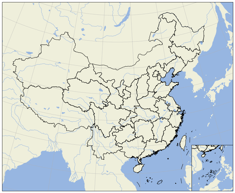
本图使用的中国国界、省界、十段线数据中,边界线数据块使用 “>” 号分隔。因此首先将其内容按照 “>” 切块,然后加载到 NumPy 中。绘图使用的代码如下:
1 | import numpy as np |
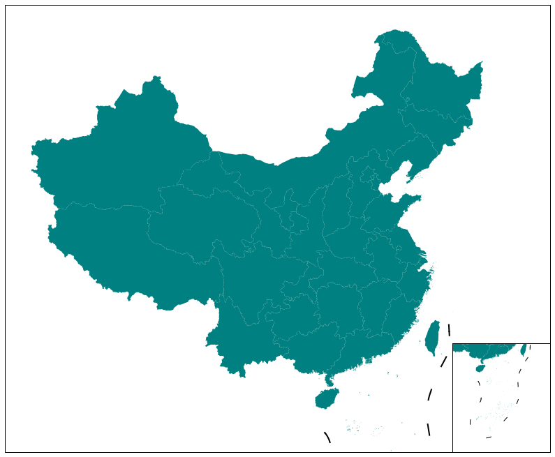
有时候你可能需要为某些省份着色,此时需要使用 Shape 文件。下图使用的 Shape 文件来自 Github,十段线继续使用 GMT 中文社区的数据。
绘图的代码为:
1 | import numpy as np |
下载对应的 Jupyter Notebook。
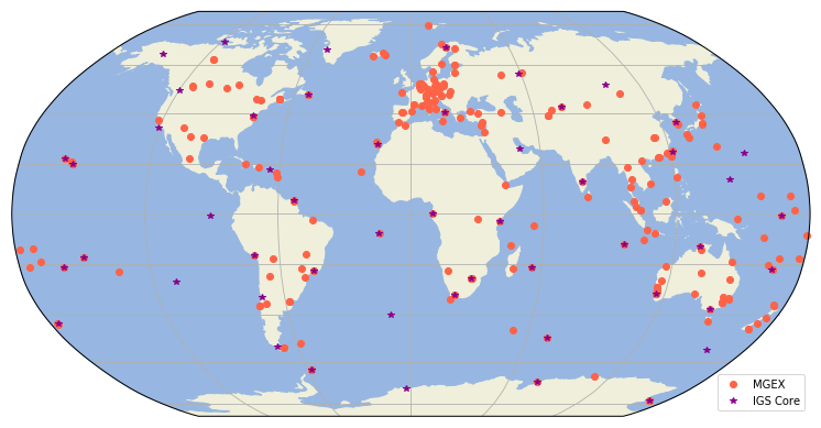
绘制 IGS 站点分布图
本图使用的 IGS 核心站与 MGEX 项目站点,及其坐标均来自 IGS 网站。我已经将其整理成为 igs-core 和 mgex 两个 CSV 文件,你可以直接下载。
1 | import numpy as np |
下载对应的 Jupyter Notebook。
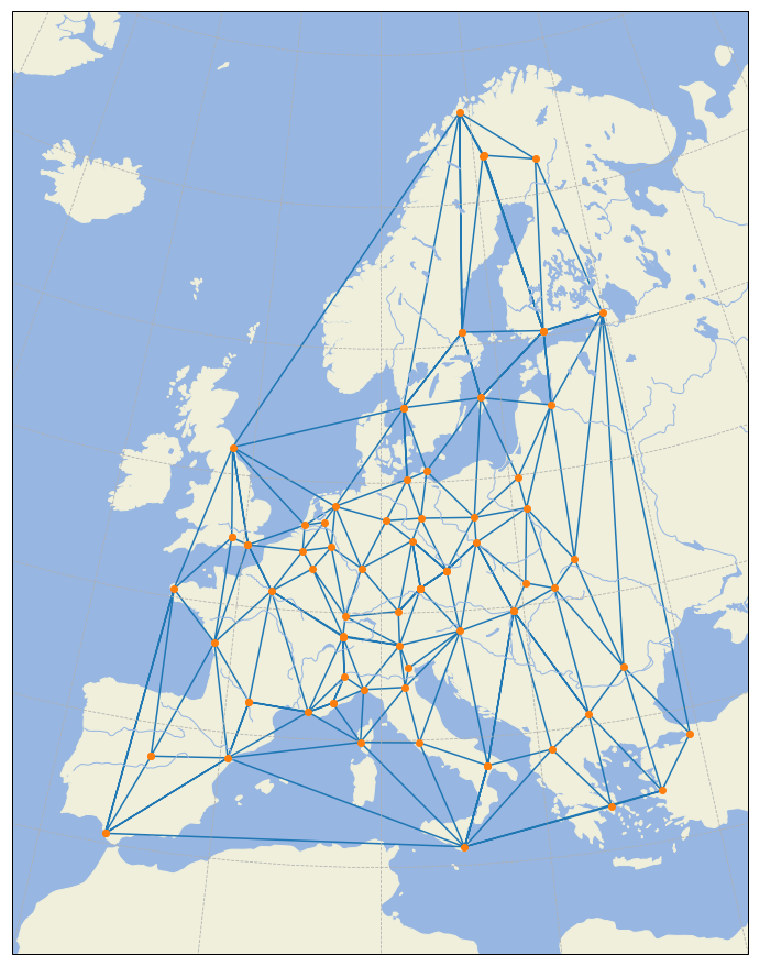
绘制 GNSS 控制网
这里使用的 IGS 站点坐标数据同样来自 IGS 网站。我已将其整理成一个 CSV 格式的文件:euro-igs,你可以直接下载使用。这里使用 matplotlib.tri 中的 Triangulation 来根据输入的点位坐标来创建 Delaunay 三角网,然后使用 plt.triplot() 方法绘制。
1 | import numpy as np |
下载对应的 Jupyter Notebook。
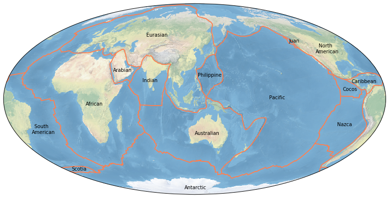
绘制板块分布图
板块构造理论将地球的岩石圈分为十数个大小不等的板块。本图使用的 Nuvel 板块边界数据来自 EarthByte 网站,我已经将其整理为一个压缩文件,你可以直接下载使用。
1 | import numpy as np |
下载对应的 Jupyter Notebook。
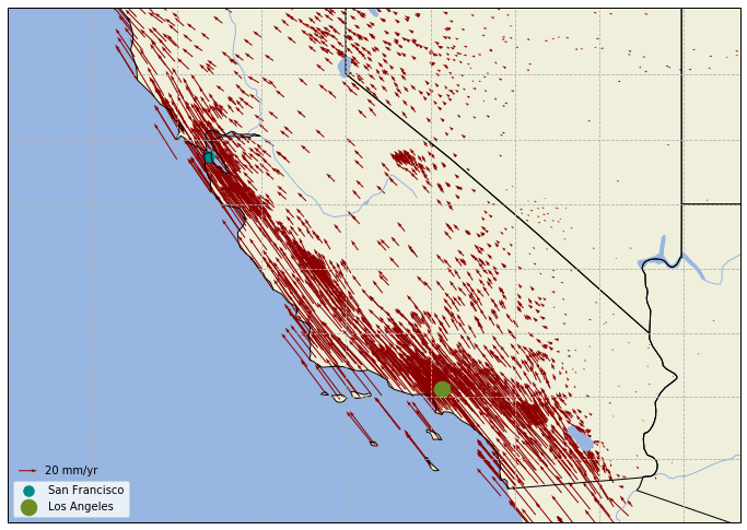
绘制 GNSS 速度场
本图使用美国西部的 GNSS 测站速度场数据,数据来自加州大学圣迭戈分校。在使用 ax.quiver() 方法绘制站速度矢量时,由于 matplotlib 自动确定的矢量长度比较短,不能够表现足够的细节。因此使用 scale_units 属性指定矢量长度单位,然后使用 scale 设置缩放程度。加州西部是著名的圣安德列斯断层,从下图中可以看出其两侧迥异的地质变化。
1 | import numpy as np |
下载对应的 Jupyter Notebook。
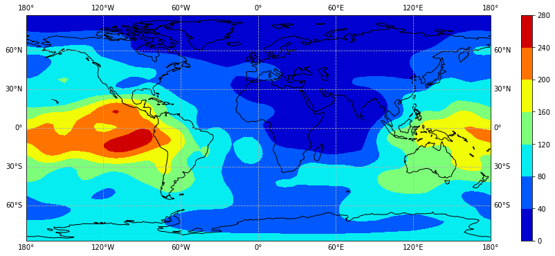
绘制电子含量分布图
Cartopy 以 matplotlib 包作为基础,可以使用 matplotlib 中的方法来绘制等值线图,只需在绘制时使用 Cartopy 处理地图投影变形。这里以绘制全球电离层电子含量图为例,模型来自北京航空航天大学·前沿电离层实验室,但只截取其产品文件 whug1420.18i 中第一个时段的数据,即使用的 1st-tecmap.dat 文件。随着 Cartopy 0.18 发布,此处的代码做了略微调整。
1 | import numpy as np |
下载对应的 Jupyter Notebook。
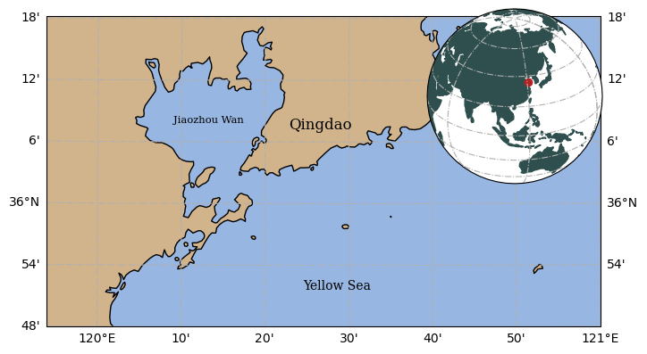
局部详图与缩略图
带缩略图的某局部图,方便显示实验位置等。依然使用了上文的 Shape 文件。
1 | import numpy as np |
下载对应的 Jupyter Notebook。
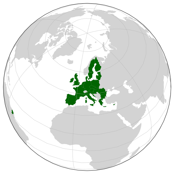
突出显示某区域
Cartopy 默认对所有地物使用相同的外观,如果需要突出显示某些地物,就必须进行筛选。这里从 Natural Earth 提供的小比例尺国界数据中,提取出欧盟国家,然后使用 ax.add_geometries() 方法将它们加入到绘图元素中。
1 | import matplotlib.pyplot as plt |
下载对应的 Jupyter Notebook。